
50 Local Link Building Strategies to Improve your Local Search Rankings
August 21, 2016
50 SEO Tips for Healthcare Providers to Get New Patients Online
September 8, 2017
According to Searchengineland.com, the SEO industry is a thriving billion-dollar industry (worth over $65 billion) that has never showed any signs of slowing down despite initially being considered a “passing fad” that would eventually fade out and die.
At the moment, there seems to be no end in sight for the growth of the SEO industry. The only thing that is certain at this point is that SEO is evolving fast and that it is rapidly switching lanes to be able to cater to the vast mobile population.
How Google Algorithm Changes Have Affected Local SEO Over Time
Google changes its search algorithm periodically, rolling out new updates up to 600 times every year. Most of these changes, thankfully, are minor and do not require a complete revitalization of your current SEO strategies. However, every once in a while Google will roll out a major change that has a significant impact on the search results.
 The Google Penguin 4.0 algorithms are some of the latest changes we’ve seen that have targeted bad links and websites. The first phase of this rollout mostly focused on devaluing these links while the second phase reversed some of the penalties imposed by the first rollout.
A more significant change in algorithm was dubbed the “Mobilegeddon” and it was released on April 22, 2015. This was the first notification that search engines were taking local mobile SEO rankings more seriously as it aimed to rank mobile-friendly sites higher than those that were still oriented around the desktop platform.
Now, fast-forward a year later to May 12, 2016, the mobile-friendly algorithm was fully rolled out. Again, the main benefits of this release were for mobile-friendly websites, which likely ranked higher on mobile searches.
Another mobile update consisted of the AMP (accelerated mobile pages) project. In October 2016, Google announced that poor mobile experiences were occurring worldwide and the AMP project would soon change that.
What you can take away from these algorithm rollouts is one simple and clear fact: search engines are definitely in favor of mobile-friendly websites.
Mobile Optimization is Crucial for Local SEO, and Here’s Why:
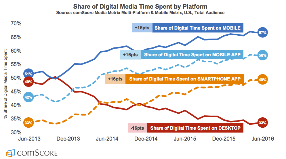
The larger percentage of online digital media consumers access the internet via their mobile devices. Reliable statistics from ComScore.com show that mobile and tablet usage currently stands at 60% combined while desktop usage continues to drop lower, making up for the 40% offset.
Mobile applications are more dominant than ever and the convenience of mobile devices is slowly overthrowing the need for people to access the internet over a desktop computer.
Needless to say, if your site is not mobile-friendly, your SEO strategies need to be refreshed. For good measure, here are a few reasons why you should optimize your website for mobile access if you haven’t already done it.
- Mobile users often search for local businesses – Ipsos.com conducted an online survey that involved 4,500 online consumers spread across different industries. The survey revealed that 88% of the searches conducted on these smartphones were indeed local searches. What’s more interesting;
- The local searches were mainly aimed at locating specific businesses – Statistics from ComScore.com show that the main reason why users conduct local searches on their mobile devices is to find local businesses, especially if said businesses sold a product or service that interested the mobile user. From this, it was also determined that:
- Mobile users use these local searches throughout the entire purchase process – The Ipsos.com survey also found out that mobile users do not just rely on local searches to locate businesses but also to conduct the entire purchase. The survey also revealed that local searches conducted on smartphones had a higher conversion rate (18%) than non-local searches (7%) and that one in three local searches was done right before the consumer visited the physical location of the business.
- Mobile sites result in more calls – If your business’s website contains all the necessary contact information, then having a mobile site will result in a significant number of calls. 61% of the mobile searches conducted in this survey resulted in direct phone calls for businesses with updated contact information.
Google’s Accelerated Mobile Pages (AMP) And Why You NEED it to Make Your Site Mobile-Friendly
Google’s AMP is the solution to all your mobile optimization needs. Compared to Responsive Web Design (RWD) which is more focused on compatibility and flexibility, AMP aims to make page loading on mobile devices lightning-fast.
Faster load times will definitely work in your favor if you are a local business since it will greatly enhance a user’s experience. Currently, AMP is more suited for published content such as informational pages and blog entries. From an overall website perspective, you still need a RWD.
A lot of times, we see non-RWDs and you can see a huge difference from the desktop and mobile versions of the website. This will definitely create a bad user experience for the customer.
Mobile Searches Outnumber Desktop Searches According to Google
Lastly, Google revealed that mobile devices were predominantly used for searches in 10 countries including the U.S. and Japan. They also divulged that the queries on mobile were mainly browser-based and derived from Google mobile apps.
By the fourth quarter of the year 2014, the number of smartphone queries had shot from 10.8 billion to 12.6 billion, while desktop searches went from 45.7 billion to 45.5 billion queries. That’s a significant difference in where users are spending their time searching online.
Although it was expected that mobile searches would overtake desktop searches eventually, no one had anticipated how rapidly it would happen.
Google elaborated that since tablets were categorized as desktops, these mobile searches were primarily conducted on smartphones, leaving no doubt in mind that SEO marketers and small businesses should turn to the mobile platform.
Free SEO Audit
Get your free SEO analysis in 45 seconds to understand your website's visibility online. Don't let clicks, traffic, leads, and revenue pass you by. Fill in the form and click the button below.
