704-288-4645

How to Do Local SEO Keyword Research Using the Right Tools
January 18, 2018
Local SEO Video: Is Your Website Secured?
February 16, 2018
Is your Business’s Website Mobile First Index Ready?
Here is a Local SEO video that I created a few weeks ago on the importance of making sure that your website is mobile ready. Especially, for local businesses, mobile search has dominated how web users utilize online search.
Google has put a higher focus on website mobile optimization. Therefore, as a business, you need to ask yourself is your website ready for Google’s mobile first indexing. Here is the video and transcribed version, enjoy!
Local SEO Video Transcription
Hey everyone, my name is Lamar. I am the founder of Organic Clicks, a SEO company based out of Charlotte North Carolina. Today is Episode three, and we’re going to discuss, “Is your website mobile first index ready?”
There’s been a lot of chatter about this new change in Google, it hasn’t been rolled out completely. They’re testing it in slow phases, but they’re planning… from my understanding they’re planning on rolling it out in a few months. But this could be good or bad for a business whether they rank in Google, if it results in more patients, or more customers, or loss of customers. So you wanna make sure that you’re prepared for being mobile first index ready.
So let’s dive right into it…
And I think we’re gonna keep it simple first, and that is really like what is indexing mean? What does it mean when Google crawls your website? So, I’m gonna play this short video. I’m not gonna spend a lot of time on this video. But just to give you a good understanding of what it means for Google to index websites.
Video Transcript Start
How does Google work?
The World Wide Web is currently made up of 60 trillion individual pages, and is constantly growing. So how is it that Google can search all of these pages in less than a second, and find exactly what you want? Well interestingly, Google doesn’t actually search the web. When you type a search term into Google, it actually searches its own internal database known as the index.
The index is like a joint filing cabinet that contains a summary sheet for each of the trillions of web pages. To create the index, Google has programs called spiders. They constantly crawl around the web, and record information about web pages like keywords, hyperlinks, and content quality.
So when you press search in Google, it searches the index, and then returns links to the webpages that it thinks are most appropriate. Although the index is considerably smaller than the Internet, it still contains over 100 million gigabytes of information.
Video Transcript End
So guys that is just a small snippet of what Google indexing means. And the ultimate goal for Google and its indexing is really to have their spiders crawl the Internet database, and find great content so that they can store this information.
So when their users searches for specific keywords, they can provide the best user experience based on the content that they’ve stored. There’s also obviously a lot of factors determining how they decide which pages to show in the search results. But that’s the goal of indexing, is to crawl these pages to sure they have a good amount of content to show their users, and provide the best content.
So the next question is, what is mobile first indexing?
Mobile first indexing; one thing you gotta understand is Google, the way it’s set up now, Google indexes your desktop website to determine how it’s going to rank it in desktop view as well as mobile view.
So it doesn’t matter where the customer is viewing the website: mobile or desktop, they’re going to index your desktop version to decide how it will rank on mobile or desktop. And obviously, your site needs to be mobile-friendly to make sure that it ranks well from a mobile standpoint, or on a mobile device.
But the way the mobile first index is going to change things, and shake things up a little bit is Google is now going to look at your mobile view, or your mobile version to determine how you rank… how your website ranks on a smartphone, and also how it ranks on a desktop.
No matter where that user is searching. If they’re on a computer or they’re on a smartphone, Google’s mobile first index is going to look at your mobile site to determine how you rank, and that’s a big change in the way they’re looking at things. And people are gonna ask why.
Why do you need to change the way you index sites, and rank them?
And if you look at this graph which has been up for a second, it shows local mobile searches versus desktop searches. And you will notice that there’s been an uptick in a trend where mobile searches have surpassed desktop searches. And this is important to them.
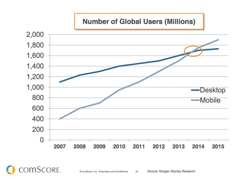
They want to be where their users are, and right now it is showing that most people are more specific with or particular to mobile phones. So that’s gonna be where they focus their indexing priorities. And you need to be ready for it, and it’s super important.
The next thing is how you prepare for this?
How do you make sure that your business is not going to lose customers, or not these rankings, and you can continue to build your brand online.
The first thing is make sure your site is responsive. And in today’s age most websites are responsive. And what responsive means is that your site will adjust, and it’s very adaptable no matter what device a user is on. Whether that’s mobile desktop tablet, your site screen and content and all that good stuff will adjust based on what device they’re on. So being responsive is very important.
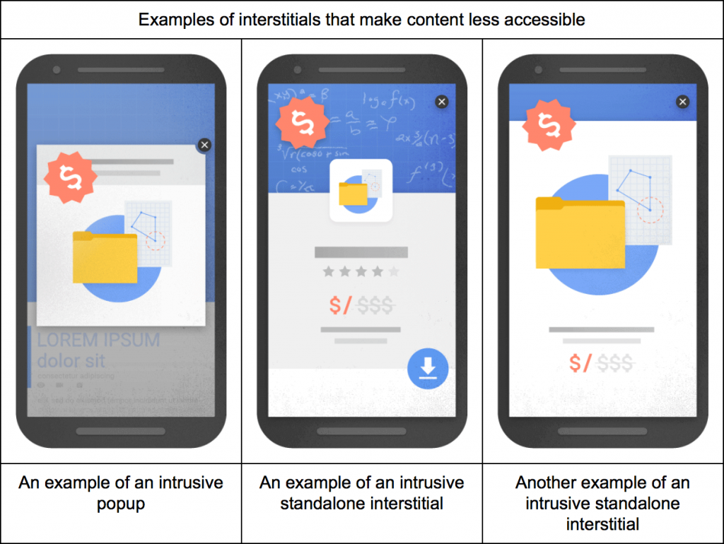
Making sure your site is mobile-friendly is also very important. Now what it means to be mobile-friendly is it’s there’s an ease of use of your site on a mobile phone. You don’t have a lot of… I would recommend not having pop-ups at all. Google has put ahem pour down on popups. On the desktop version, that’s okay. But on mobile I would advise not to.
Optimizing for speed; Optimizing your mobile site for speed is going to be very, very important. And if you can execute the amp; the accelerated mobile pages project on your site, that’s even better.
Let’s say you do have a mobile site. You wanna make sure that your content matches your desktop content. And the reason why is some people are like, “I don’t wanna have a whole bunch of content on my mobile site. It’s a smaller screen. I don’t wanna overload people on a smaller view.”
And now that Google is making the mobile site more important, rankings are based on keywords. It’s ranked on content. So you wanna make sure that it’s matched to your desktop version.
Don’t reduce the content just because you want less focus on that screen. You want the same amount of content. And that’s the good thing about a responsive website design is that it matches; it’ll match content from desktop to mobile.
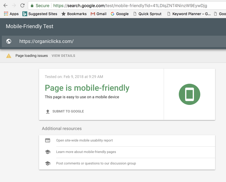
So you wanna test a lot. You wanna make sure you’re testing your mobile site, and there’s some ways that you can test. So the mobile-friendly test is something that Google provides to you, and I’ll put all these links in the description. But you can see my site here. It’s says it’s mobile-friendly. You wanna use a search console crawl, and render feature to see how your mobile website looks to Google. So you can actually see that in the search console.
You wanna test for speed, so the Google’s page or Google’s insight Page Speed tool will allow you to test to see how your site, your mobile site is from an optimization standpoint for speed.
Structure data is important. You wanna make sure that your structure data whether this reviews, or your location is matched with your desktop version. So it’s super-important to make sure you’re testing.
If you don’t have a mobile site, that’s fine. Google will still crawl your desktop version, and determine how to rank your website. But we don’t know how that’s really going to affect until they fully roll out this mobile first index. But I would recommend having a responsive website design.
Well that’s it for today. I hope this was valuable information. I hope you’re preparing your website for the mobile first index. If you have any questions, don’t hesitate to reach out. I do appreciate your time, and I look forward to seeing you guys next week, thank you.
Free SEO Audit
Get your free SEO analysis in 45 seconds to understand your website's visibility online. Don't let clicks, traffic, leads, and revenue pass you by. Fill in the form and click the button below.
